Mastodon – Collapsed Text, Exposed Image ?

Proposing a new Feature to Mastodon
This post intends to highlight a proposal for a Mastodon Feature enhancement. It was originally posted as a Toot here, and later copied in stripped plain text format at Qoto.
The core idea is simple — to allow a user to post Long Text, while collapsing it for display in the various timelines. For aesthetic reasons, as it will look better in a crowded TL listing.

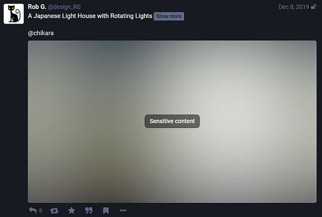
This CAN be accomplished via the Content Warning controls; but these will also hide the image behind a Blur, as CWs were really developed for hiding the contents of a post unless the user decides to interact with it.
If CW can collapse the Long Form text, why something new ?
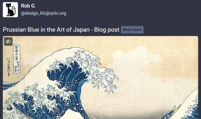
The problem is that CWs hiding the image, will make the Post Title the ONLY exposed part of it; and our search for readers and interactions suffer from that.

As seen above, this is not optimal to attract a reader, our goal in Publishing something else than one line commentary. Snapshot is from this post, and made as a suggestion to Chikara, who was an esteemed user and active poster — missed nowadays.
Logic Explained ?
The posts Chikara made were quite interesting – personal investigations of aspects of Science, Technology, Art and Culture of Japan which got his interest.
For an insight, the full text of the Article in snapshot above, which lead to my suggesting a Collapsed Text format is 295 words, 2,092 characters, according to WordCounter.
At the typically limited Mastodon instance, with the default 500 characters maximum toot, it would take 5 Toots to send; and likely we would NOT even bother. (it is a dismal idea, that limit.)
My Suggestion to Chikara at the Time (December, 2019)
** Editor note: ** I am just testing out @chikara's post with a suggestion of a possible new layout. His OP is here
I think that having a Content Warning to wrap the text will give it better exposure – if a catchy CW Description text is used, maybe people will click and expose it. The images selected for a post are ALSO important in attracting readership.
We are basically on the business of Publishing here, and fending for attention from users who have a never ending scroll on their Feeds.
Hope you consider this and don't mind it, Chikara. Also, this suggestion is a method I use and would recommend to Anyone wanting feedback, readers and interaction.
** Thank you for your detailed posts! @design_RG...
Chikara undestood, accepted and used the Collapsed Text via CWs for a time; but like myself, who was also using it for the reasons stated, he saw a drop in user interactions — as the TITLE was now the ONLY exposed part of the whole post.
We had less Favourites, Boosts and likely readers, overall. Now, 6 months later, I am bringing forward this idea, as a Request for Comments and discussion.
Mastodon Feature Suggestion and Request (June, 2020)
Putting this out quick and dirty, from the Toot Editor and without nice formatting but it's important and maybe someone can help or take interest on it?
Proposal :
a. To add a new setting that allows people to create a post which will Collapse the text body (similar to what a CW does)
b. While keeping the post attached Image(s) VISIBLE.
Rationale :
c. This is intended for presentation, visual purposes. For those of us who produce Long Form content, and yet would like to have a more compact displayed Toot in the Feed lines.
d. The poster considering this would select the C.W. style warning text line as an Article Title (similar to newspaper or magazine headlines)
e. And select with care a good, related, catchy image to pass some of the content idea and attract a reader into the folded write up.
Benefits :
f. A more compact Toot, taking less visual space, vertically, while still beign able to communicate with users via Title and an exposed image..
g. How is this different from the current CW feature? The Image is NEVER shown in a CW post, so all that can catch and bring in a reader is the TITLE itself.
Experience :
h. I have done this in the past, liked the visual it produced, but not the lack of readers, as shown by the low interaction.
i. due to that, while I had show and recommended this practice (Long Post being always wrapped in CW), I gave it up soon, based on experienced results (item h).
Example : This blog post banner, a snapshot of my post but with the image exposed.
Follow Blog via your Fediverse/Mastodon account :

@rgx@write.tedomum.net
This page created entirely in MarkDown language. Thank you for reading, feel free to comment about this post – reach me at my Writer's Lounge.
 R.G.
R.G.