Better fonts improve Web reading experience
Verdana Pro — why use 'Arial'
...when something much nicer is freely available?
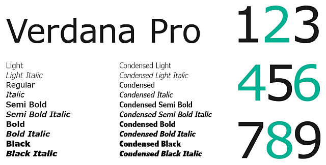
Verdana is a humanist sans-serif typeface designed by Matthew Carter for Microsoft Corporation. This typeface was originally release with Windows 98 as part of our vision to significantly improve on screen reading time. Verdana Pro adds light, semibold and black styles with italics, as well as condensed styles with italics across all weights.
-source: Microsoft
Why is Verdana better for screen reading?
Bearing similarities to humanist sans-serif typefaces such as Frutiger, Verdana was designed to be readable at small sizes on the low-resolution computer screens of the period.
- Like many designs of this type, Verdana has a large x-height (tall lower-case characters), with wider proportions and looser letter-spacing than on print-orientated designs like Helvetica.
- The counters and apertures are wide, to keep strokes clearly separate from one another, and similarly-shaped letters are designed to appear clearly different to increase legibility for body text.
- The bold weight is thicker than would be normal with fonts for print use, suiting the limitations of onscreen display.
-source: Wikipedia
20 different styles on the Windows Store download pack, Free. Verdana and Georgia were specially developed for on-screen reading.
Verdana typeface info, Wikipedia
And it's a FREE Download from :
Georgia is also a better on-screen font
...designed to replace a serif font like Times New Roman.
Georgia is a serif typeface designed by Matthew Carter for Microsoft Corporation in the mid-1990s. This typeface was designed as a serif companion to the Verdana font family with a goal to appear elegant but legible on low-resolution screens as well as when printed at small sizes.
-source: Microsoft
Georgia was intended as a serif typeface that would appear elegant but legible when printed small or on low-resolution screens. The typeface is inspired by Scotch Roman designs of the 19th century.
As a transitional serif design, Georgia shows a number of traditional features of “rational” serif typefaces from around the early 19th century, such as alternating thick and thin strokes, ball terminals and a vertical axis.
Closer inspection shows how Georgia was designed for clarity on a computer monitor even at small sizes. It features:
- a large x-height (tall lower-case letters);
- its thin strokes are thicker than would be common on a typeface designed for display use or the greater sharpness possible in print.
- Its reduced contrast and thickened serifs make it somewhat resemble Clarendon designs from the 19th century.
-source: Wikipedia
Also a FREE Download from :
Improve your on-screen Browser reading
...by selecting custom fonts which were developed for this exact task. Professional work, skilled designers. All for no cost and a minimal effort.
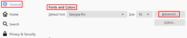
Install the better fonts (if not in your system yet) and :
- Go into your web browser's 'Settings' (or 'Options') panel.
- Locate the 'Fonts' control. Screenshot shows Firefox's :
- Select the 'Advanced' button to access all the font options.
- For Serif – replace 'Times New Roman' with much smoother 'Georgia'. ✔
- For Sans – replace 'Arial' or 'Sans' with 'Verdana Pro'. ✔
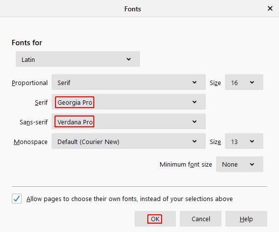
Press the 'Ok' button to save our selections. And voilá. Enjoy. Repeat this customization for other systems you use regularly as well. 😉👍
#FediReporter tips for better web reading experience #rgxJournal #Typefaces #Design are important

@rgx@write.tedomum.net
This page created entirely in MarkDown language. Thank you for reading, feel free to comment about this post – reach me at my Writer's Lounge.
 R.G.
R.G.