Wishlist – wider rez screens layout support?
In the lovely Pinafore client.
As a laptop user primarily, it's been an uphill battle getting good clients for #fediverse which recognize and respect the fact we have lots of pixels.
Responsive Design is great – I have started learning and practising it, understand the logic. Good stuff.
But, honestly – the internet has too much to offer for real work to be performed in a mobile device. Content creation, we need better software that allows us to use what's in our chosen platform.
Case in point, Wide Screen Displays.
Which I have made various attempts at getting improvements for. The default Mastodon web client is not very friendly to wide screens. Yes, there's the TweetDeck like AWI, and I have written and spoken to Eugen with some requests.
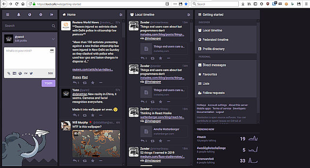
Here's the Mastodon web client, with the Advanced Web Interface (AWI) enabled. It defaults to those dreadful, skinny, non-resizeable columns. TweetDeck inspired, as Eugen was a Twitter user for many years and freely admits the AWI provenance. 😉
A proposal, presented.
Eugen and I chatted in a topic I started at his own instance. He couldn't understand my wish of having TWO wide panels in the AWI setting, yet those two using the full width of my screen.
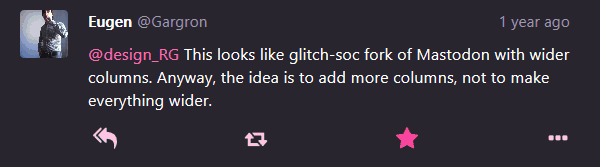
Not much success there. 🙄😕
Then, a solution was found. Until, it broke.
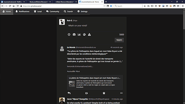
Independently, I found a great way to use wide screens with the Collapsed Mastodon Firefox add-on. Worked wonderfully, and was so productive for me that I left aside #Pinafore, my client of choice – other than the small question of it using a single column content panel.
Here's what it looked like :
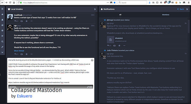
Shown above – Todon.nl's local timeline, via Mastodon web client. Browsed via Waterfox (Firefox family variant) with Collapsed Mastodon Firefox addon enabled. Two Wide panels chosen, other layouts possible, as desired. This is very unique and the most efficient workspace for Fediverse I ever had.
Writer's delight
That layout is perfect for someone reading and writing long form content, which is my case. It was possible, with Collapsed Mastodon, but changes in mastodon code starting at v.3.1.4 broke the add-on. What it did was no longer possible, so game over there.
Since AWI was no more...
...I now had no reason not to use the superior, fast, elegant Pinafore. Other than the OMG, so much screen area not being used, it's the very best client I know for the Fediverse instances. Mastodon and Pleroma are both supported.
There's the small question of maybe using a little MORE of my screen, though.
(centered on the screen. On my 1600 pixels wide display, that is using 600 pixels, about 40% of my screen's width. Only. Arghhhhh)
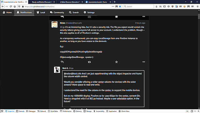
@nolan@toot.cafe is a talented programmer, and gracious in listening to the Pinafore users. He accommodated many requests to make Pinafore the best client for people using Screen Readers, for example.
Widen up the content panel?
Now, I am tinkering and trying things out. Posted some screenshots yesterday here, with a comparison – the current layout, and a tweaked, wider content panel, showing 800 pixels screen width.
Wowa! Much more information now. 50% of my screen in use!
This 800 pixels content panel was done by a on the fly css edit, manual. (I scrolled around in the css code until found the right property to change. Worked!!)
Sadly, hitting a Refresh wiped out my handy work. Oh, my.
Is it too wide? Maybe, it's a question of taste; it makes sense to me.
Twitter supports wide screens better
For comparison's purpose, I did some testing, and on the Twitter web client I was able to get this :
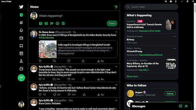
Screenshot above shows what their client can do, off the box, just by manipulating the provided controls. Screen scaling to 125%, and the font size reduced to the smaller setting. Snapshot taken in the Bravo browser.
Result? The central Content panel is shown here – at 750 pixels width.
Twitter does use the right side area for various boxes, like the Trending and Who to Follow shown. So it's not unreasonable that it has the width shown.
(Detail – my scaling up the whole screen in the browser was intended to collapse the labels for the icons in the left panel; which are superfluous for regular users, who know what they do)
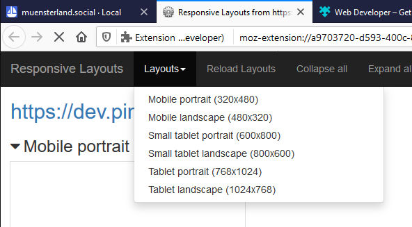
Pinafore Responsive Layouts
Shows 3 classes of devices, see screenshot above.
- Mobile ( 320x480p) portrait/landscape
- Small Tablet (600x800p) 2 modes also
- Tablet (768x1024p) standard iPad res, 2 modes also
If we could get a couple of added new classes it would be wonderful. Could we, please ??
Desired new modes :
- Laptop with MDPI screen at 1280 x 800 p.
- Laptop with HiDPI screen at 1440 x 900 p.
With these two added, I would be able to see Pinafore in all its elegance and using my screen more efficiently.
I have spoken extensively with @lanodan@queer.hacktivis.me about getting this kind of support in place for #pleroma #mastoFE. He understands, and is working on it; being the only person maintaining that branch of Pleroma's FE project isn't easy, kudos to him.
Now, maybe Nolan could accept this request ? It would be wonderful.
Maximum Characters per line?
As Lanodan pointed out on a reply to the original Toot which is now this post, there are criteria for how many characters to display, per line.
We got to consider that too.
There is a time tested optimum width for text readability. The Write.freely blogs css code shows 50 em setting, for example.
I have been customizing my own blog, will try at up to 80 em like you suggested. That applies to a new wider Pinafore class of devices too — appreciate the insight!
Famous Last Words
Thank you all for the work you do in benefit of the many fediverse users.
#FediReporter on the crusade for better wide screen devices support.
(Uphill battle, but we shall persevere) #mastodev #UI #UX
Banner Photo by Alejandro Escamilla on Unsplash – Thank you!
@rgx@write.tedomum.net
This page created entirely in MarkDown language. Thank you for reading, feel free to comment about this post – reach me at my Writer's Lounge.
 R.G.
R.G.